Good patch artwork is simple, bold and sized for the finished patch, not for your screen. Keep the shapes clean, make the lettering big enough to read, limit the colours, and send a vector file if you have one. If your design depends on gradients, photos or tiny text, choose a printed patch instead of an embroidered one. This guide shows you how to get there, with real size limits, file advice and a checklist you can use before you order patches for a birthday, a team event or a gift.
TL;DR
- Embroidery stitches thread, not pixels, so bold shapes, thick lines and few colours work best. Gradients, hairlines and tiny words do not.
- Lettering should be about ¼ inch (6 mm) tall or more at the finished size. Lines should be at least 1 mm thick.
- Vector files (AI, EPS, SVG, PDF) are the safest starting point. A high-resolution PNG can work for a simple design.
- Detailed or photographic art belongs on a printed patch. Check the proof for spelling, colour and centring before you approve.
- Decide the finished patch size before you draw anything else.
Table of Contents
- Start with the patch size, not the drawing
- Pick the patch type that suits your artwork
- Why embroidery changes your artwork
- How to simplify your artwork in six steps
- When printed patches are the better choice
- File formats and resolution
- What to think about for party favours and gifts
- Check the proof like a proofreader
- Our point of view
- Ready to put your artwork on a bag?
- FAQ
- Sources
Start with the patch size, not the drawing
Most artwork problems begin the same way. Someone draws a lovely design on a full screen, then it gets shrunk to a patch two inches wide. The details that looked sharp are now smaller than a stitch.
So decide the finished size first, then design inside it. Think about where the patch will sit and how far away someone will look at it. A patch on a loot bag that a child holds at arm’s length can carry a little more detail than one on a cap that people see across a room. Our patch size guide walks through picking dimensions for bags, and patch placement on bags covers where patches hold up best.
A practical way to work: open your design software, set the canvas to the real finished size (for example 2 × 2 inches), and zoom to 100 percent. If you cannot read something at that zoom, a stitched patch will not show it either.
Pick the patch type that suits your artwork
The type of patch decides what your artwork can do. Here is a plain comparison of the common choices.
| Patch type | Best for | Weak spots |
|---|---|---|
| Embroidered | Bold shapes, clean lines, big lettering, limited colours | Gradients, thin lines, small text |
| Woven | Finer line work and smaller lettering than embroidery, flatter finish | Less raised texture |
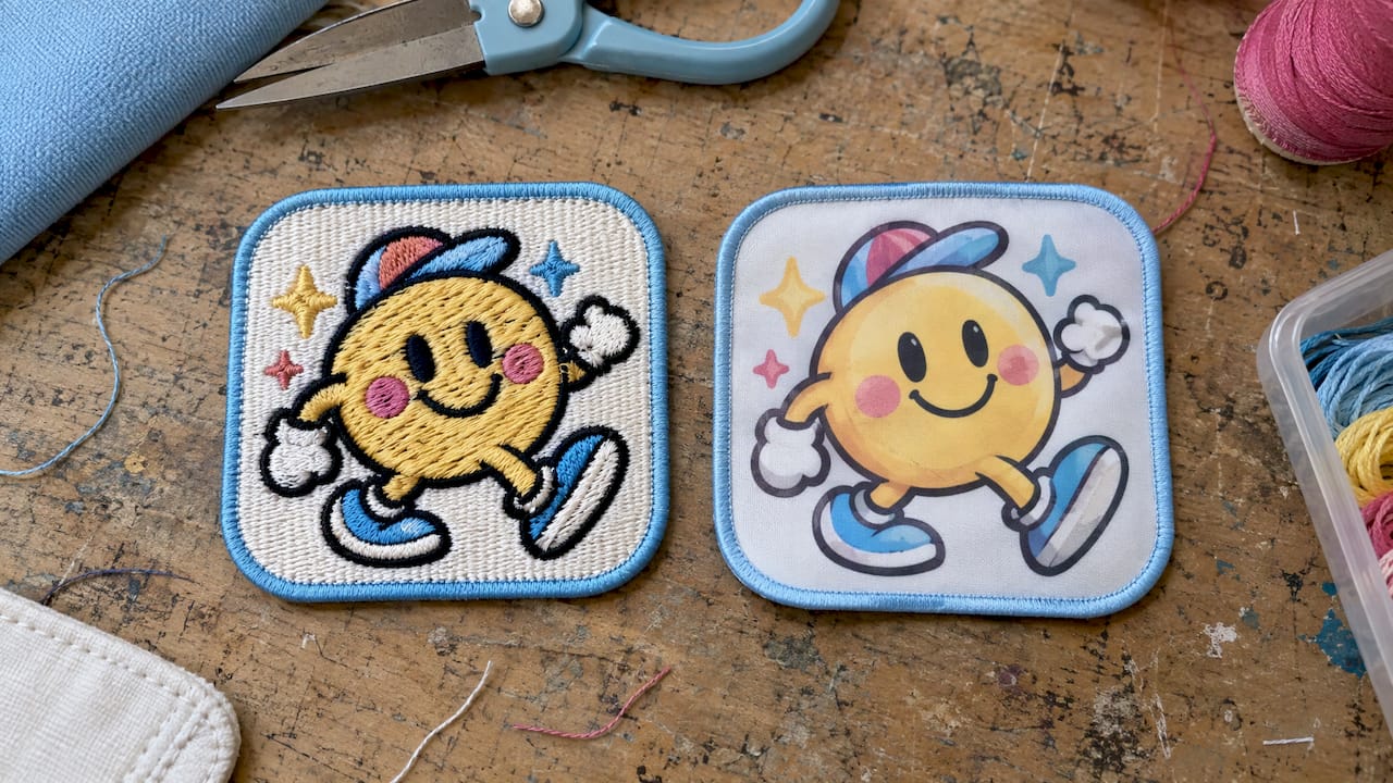
| Printed (sublimated) | Full colour, gradients, photos, small text, cartoon characters with soft shading | Flat surface, no raised thread texture |
| Chenille | Large, simple shapes and letters (think varsity style) | Fine detail |
If you are choosing between stitched and applied options, our guide to patches vs embroidery explains how the methods differ on a finished bag. For letter-style patches, see our page on chenille letter patches and how chenille patch durability plays out over time.
A simple rule of thumb: if you can describe your design in a few flat colours and thick shapes, embroidery will flatter it. If you describe it as a painting, a photo or a character with shading, go printed.
Why embroidery changes your artwork
An embroidery machine does not print a picture. It lays down thread, and thread has width. That means every line, gap and letter has a minimum size below which the stitches simply merge.
The manufacturer guidelines we checked agree on the basics:
- Lettering: one major cap maker asks for text at least 0.25 inches high, or 36 pt at the final size, for embroidered and woven patches.
- Line thickness: another decorator’s artwork guide sets a minimum line of 1 mm and text at least 4 mm tall for embroidery, and warns against thin serif or script fonts below that height.
- Tiny gaps: the cap maker adds that detail below 1 mm on flat embroidery is subject to error, because gaps can close and shapes can distort.
Treat the larger figure, a quarter inch for letters, as your comfortable target and 4 mm as the floor. A name that has to fit on a small patch is the most common squeeze. Choose a thick, simple, upright typeface rather than a delicate script. Our list of embroidery-ready name fonts for bags is built around exactly this problem.
Gradients, shadows and soft edges
Thread cannot fade smoothly from pink to purple. A gradient has to become two or three flat blocks of colour, and a drop shadow becomes either a solid shape or nothing at all. Do this conversion yourself before you send the file, so the result is your choice and not a surprise on the proof.
Colour count
Embroidered and woven patches have a colour ceiling. The cap maker above lists a maximum of 8 colours for these patch types, while sublimated patches are full colour. Different makers set different limits, so confirm the number with whoever produces your patch. In practice, three to five well-chosen colours look better than eight crowded ones.
How to simplify your artwork in six steps
- Find the one idea. A patch is a small sign. Choose a single visual idea, such as a dinosaur, a name, or a star, and let it fill the space.
- Remove what does not matter. Cut background textures, tiny sparkles and secondary slogans. If a word is optional, drop it.
- Thicken everything thin. Pull hairline strokes up to at least 1 mm at the finished size. Round off sharp, narrow points.
- Flatten colour. Replace gradients and shadows with flat fills. Keep colours clearly different from each other so neighbouring areas do not blur together.
- Add an outline. A solid border around the shape cleans the edge and helps a patch read against a coloured bag.
- Shrink it to real size and look again. Print it at actual size on paper or view it at 100 percent. Anything you squint at needs to be bigger or gone.
A worked example
Say you are planning a dinosaur-themed birthday and want a patch on each loot bag that shows the child’s name and a cartoon T. rex with a green gradient belly and tiny teeth.
At a 2.5 inch patch, the problems are easy to spot. The gradient belly becomes two flat greens. The teeth are narrower than 1 mm, so we would widen them into three chunky triangles or drop them. The name “Alexander” is nine letters in a thin script. Switching to a thick block font at roughly a quarter inch tall makes it readable. The final patch has a green dinosaur, a bold name and a yellow border: three or four colours, nothing fussy, and it looks deliberate rather than cramped.
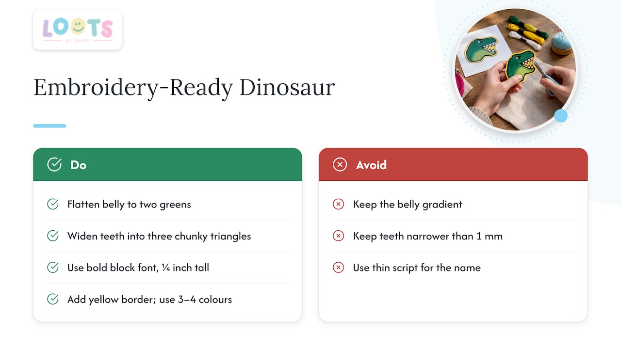
If you really want the shaded belly and the tiny teeth, that is a signal to go printed, where gradients and small details carry through.
When printed patches are the better choice
Printed patches suit detail-heavy work. They reproduce full colour, soft gradients, small text and photographic images, because the design is printed onto the fabric surface rather than built from thread. That makes them a natural fit for cartoon characters, photo-style artwork, and designs with lots of colours.
The trade-off is texture. You lose the raised, stitched feel that many people love on a bag. Think about what you want the patch to say: a tactile, classic look suits embroidery, while a crisp illustration suits print. For a one-day party favour, either can be right. Choose based on the artwork, not on habit.
File formats and resolution
For most patch makers, a vector file is the best thing you can hand over. Vector artwork (AI, EPS, SVG or a vector PDF) is built from shapes and lines rather than pixels, so it can be resized without going blurry. That matters because patches are made at a specific size and the maker may need to scale your design.
The cap maker’s requirements list EPS, AI, PDF, TIFF and JPG as accepted formats, with raster files at 300 DPI. If you only have a raster image, make it as large and clean as possible.
A quick file checklist:
- Save a vector version if you can, and keep the original editable file.
- Convert all text to outlines (also called paths). The screen-printing and embroidery guide linked above says fonts must be outlined or expanded before submitting, so the maker does not substitute a different typeface.
- Use a high-resolution PNG with a transparent background if you do not have vector art.
- Avoid screenshots, social media profile pictures and photos of an existing patch. They are low in detail and the edges come out soft.
- Note the finished dimensions, colours you need matched and any detail that must not change.
What to think about for party favours and gifts
Artwork for a party is different from artwork for a uniform. A few things deserve extra thought.
Names and spelling. On personalized favours, a misspelled name is the mistake everyone remembers. Check every name against the invitation list, letter by letter.
Readability at a glance. Kids and guests will see the patch for a moment. A bold name and one picture beat a crowded collage.
Theme colours. If the party has a palette, give exact colour references rather than describing them in words. Screens vary, so a swatch or a colour code is safer than “sort of teal”.
Quantity and consistency. When you order for 10, 20 or 50 guests, one design with the name changed is easier to proof than 50 different pictures. Ideas for bag patches are in our 12 patch ideas for bags.
Wear and washing. If the bag will be used for months, think about how the patch is attached and how it will be cleaned. Our guide on materials and press times for patches covers keeping patches on.
Check the proof like a proofreader
A proof is your last chance to catch a mistake, and an approved proof usually goes straight into production. Go through it in this order:
- Spelling and dates. Read every word aloud, then read it backwards.
- Lettering clarity. Look for letters that close up, such as the loops of a, e, B and g, and for letter pairs like “rn” that could read as “m”.
- Colours. Compare against your references, knowing a screen is never a perfect match for thread or ink.
- Centring and border. Make sure the artwork sits evenly inside the patch shape and the border looks the way you intended.
- Size. Confirm the final dimensions on the proof match what you planned.
If something is unclear, ask before approving. It is much easier to fix a file than a finished batch.
Our point of view
At Loots by Shiry, the whole idea is that you drive the design. Names, colours, patches and themes come from you, so the artwork matters more than anything else on the bag.
Our advice is to design small and bold. A patch that reads clearly from an arm’s length does more for a party than a detailed picture nobody can make out. Pick one theme, one strong colour combination and a name in a simple, thick typeface, and the bag looks planned and personal.
We would rather help you land on a design that works on the first try than have you redraw it twice. Bring your idea, your colours and the names, and we will work from there.
Shiry
Ready to put your artwork on a bag?
Once your design is simple, sized and spelled correctly, the next step is choosing what carries it. We offer customizable loot bags where you choose the names, patches and colours, plus wrapping at $0.50 per bag and delivery at $10. You can see the options on our loot bags page.
If you want a gift or favour that is not a loot bag, our shop has cotton tote bags and pastel pouches at $12.00 each and colour changing tumblers at $10.00. For ideas on what to pack, see our custom loot bag ideas and 20 pouch favour ideas.
FAQ
What is the best file type for patch artwork?
Vector files such as AI, EPS, SVG or a vector PDF are the best choice, because they scale without blurring. If you only have a raster image, send a large, sharp PNG or JPG. Convert text to outlines so fonts do not change.
How small can text be on an embroidered patch?
Aim for letters about ¼ inch (6 mm) tall at the finished size. One decorator’s guide gives a floor of 4 mm tall for embroidery, and thin serif or script fonts need to be larger still. Thick, simple fonts hold up best.
Can I put a photo or gradient on a patch?
Not on an embroidered one, because thread cannot blend colours smoothly. Printed patches handle photos and gradients well. If you want embroidery, simplify the photo into a few flat colour shapes.
How many colours can I use?
It depends on the patch type and the maker. One cap maker lists a maximum of 8 colours for embroidered and woven patches, with sublimated patches in full colour. For a clean look, three to five colours is a good target.
What should I send along with my artwork?
Send the finished size, the patch type you prefer, the shape and border, the number you need, and any colours that must match. Point out anything that must not change, such as a spelling. Clear notes help the proof come back right.