For names on bags, go with bold sans-serifs like Arial, Montserrat, or Bebas Neue. If you want a script, Sacramento and Lobster work, but only when sized generously. Scripts fail more often than any other style, mostly because owners size them too small or skip a sample run. Always test on the actual fabric before ordering a full batch.
TL;DR:
- Bold, simple sans-serif fonts like Arial, Montserrat, or Bebas Neue are best for everyday and durable bags due to their consistent stroke widths and embroidery friendliness.
- Script fonts such as Sacramento and Lobster are suitable for monograms or gift bags when sized large enough but risk illegibility if too small, especially on textured fabrics.
- Embroidery requires larger font sizes, with minimum heights of around 4mm for bold sans and 12mm for scripts, to avoid stitching failure or blurring.
- Loose or textured fabrics demand bolder strokes and lower stitch density, while smooth weaves tolerate finer details and thinner fonts.
- Always test fonts with a sample on the actual fabric before ordering in bulk to prevent costly mistakes and ensure durability and legibility.
Table of Contents
- Best name fonts for bags, sorted by use
- How does bag fabric affect font choice?
- What size and file specs actually work?
- Which font style fits which bag?
- How do you test a font before a full production run?
- Common mistakes in font selection (and how to fix them)
- How to adapt a font for better readability and durability
- Legibility over looks: a short editorial take
- Order a sample before you commit to a full run
- Sources
- FAQ
Best name fonts for bags, sorted by use
Not every name font belongs on every bag. A font that looks charming on a birthday invitation can turn into a blurry mess once it hits canvas at 2.5 centimetres tall. Sorting by use case saves you from that mismatch.
Everyday and durable bags need fonts that survive backpack straps, washing machines, and years of handling. Arial, Montserrat, and Bebas Neue top this list for good reason: their stroke widths stay consistent at almost any size, and they digitize cleanly for embroidery without needing heavy simplification first. Bebas Neue’s tall, condensed caps also fit more letters into a tight name plate, which matters if you’re stitching a longer name like “Alexandra” onto a small tag.
Monograms and initials give you more room to play because you’re usually working with one to three letters at a larger size. Classic monogram scripts or a chunky display serif can work beautifully here, since the extra size compensates for the finer detail.
Party loot bags and playful gifts can handle bolder handwriting styles or a chunky script sized up, especially if the bag is a one-time favour rather than a daily-use item. This is where Lobster shines. Its rounded, friendly curves read as fun without collapsing into illegibility, provided you size it well above what looks “right” on screen.
Luxury-style bags call for restraint, as shown in examples like J’Adore Blu, where balanced typography and premium presentation create an elegant gift. A clean serif or refined geometric sans with high-contrast thread reads as premium far more reliably than an ornate script. Balanced spacing and a sheen-heavy thread colour do more for a luxury look than the typeface itself ever will.
- Everyday/durable: Arial, Montserrat, Bebas Neue
- Monograms: monogram scripts or display serifs, sized large
- Party loot: Lobster, bold handwriting styles
- Luxury: clean serif or geometric sans, high thread contrast
How does bag fabric affect font choice?
Canvas, cotton twill, and looser cotton blends don’t all take a font the same way. Heavy canvas holds up well under bold block fonts because the weave gives stitches something solid to grip. A loose weave, on the other hand, lets thin strokes fray or pucker, especially around tight curves in a script letterform.
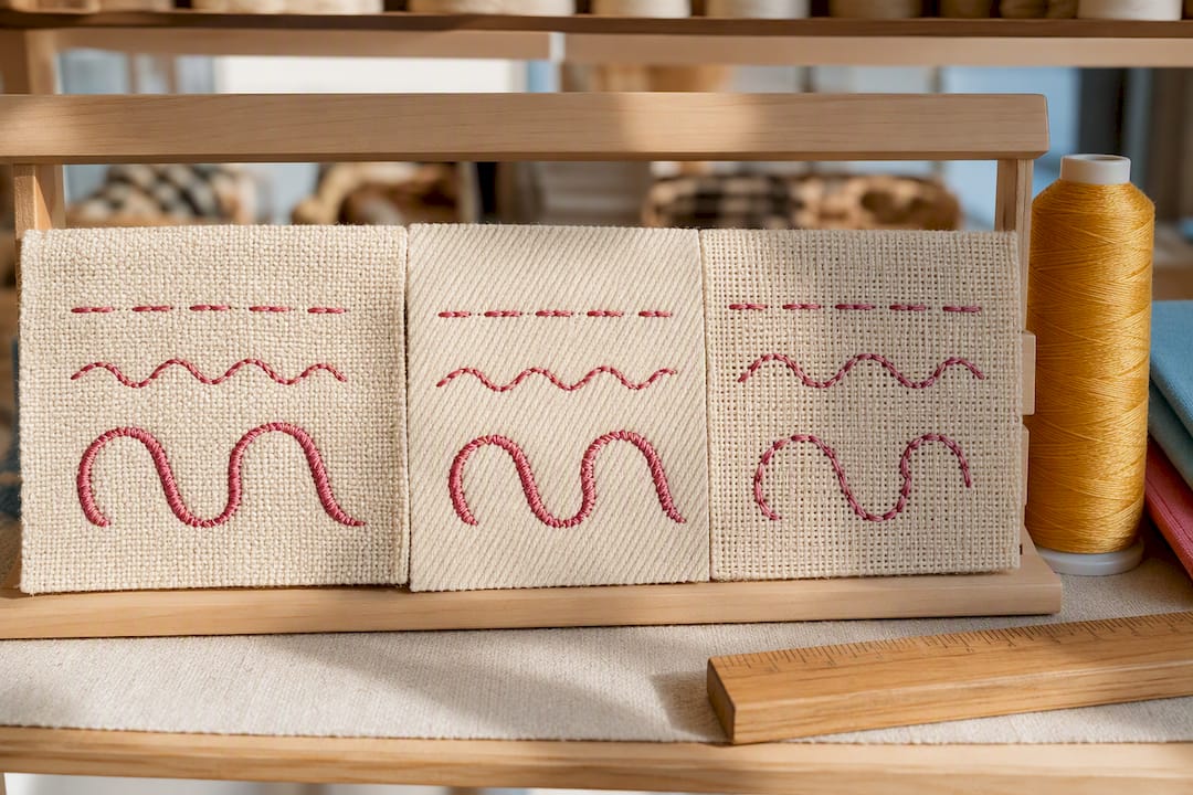
Printing tolerates far more detail than embroidery does. If you’ve fallen in love with a delicate script, printing is usually the safer route rather than forcing it through a needle. Embroidery adds its own set of physical constraints on top of the fabric: thread pull, underlay, and stitch density all shift how a letter actually looks once it’s stitched rather than drawn.
Two quick fabric rules to keep in mind:
- Loose or textured weaves need bolder strokes, more underlay, and lower stitch density to avoid puckering.
- Smooth, tight weaves (and printing in general) can handle finer serifs, thinner scripts, and tighter details without distortion.
If you’re leaning toward embroidery, provide a simplified, editable version of your chosen font. If you’re printing, supply vector artwork with strong colour contrast between the text and the bag material.
What size and file specs actually work?
Font size on a bag isn’t a style choice, it’s a physics problem. Stitches have a minimum width they can hold before they collapse into a blob, and ink has a minimum line weight before it bleeds or disappears into fabric texture.
As a rough guide, bold sans-serif letters can work down to around 4 millimetres in height, regular sans needs closer to 6 millimetres, serif fonts need about 8 millimetres, and scripts need 12 millimetres or more to stay legible once stitched.
Minimum stroke width matters more than most people expect. Experts recommend keeping embroidery strokes at least 1 millimetre (0.05 inches) wide to keep thread stable and prevent fraying, particularly on heavier canvas totes.
A few more rules worth locking in before you send a file to production:
- Send vector files (.AI, .EPS, .SVG, .PDF) whenever possible; if raster is your only option, export at 300 DPI at the final printed size.
- Loosen your kerning for embroidery. Tight letter spacing that looks fine on screen often merges into a solid blob once stitched, since stitches and fabric movement visually eat up that gap.
- Avoid overlapping or touching letters entirely. Embroidery digitizing struggles with shapes that share edges.
Which font style fits which bag?
Every font family carries a different personality, and matching that personality to the bag’s purpose is half the job. Here’s how the main categories break down.
Block and sans-serif fonts deliver durability and small-size readability better than any other category. Arial and Montserrat are the reliable workhorses here, and Bebas Neue adds a bolder, more condensed option when you’re short on horizontal space.
Rounded sans fonts soften that same reliability into something friendlier, which is why they show up so often on kids’ backpacks and casual loot bags. They keep the stitch-friendly stroke consistency of a standard sans while looking less corporate.
Serif fonts carry an elevated, premium feel, but they demand more care. Serifs have thin and thick strokes within the same letter, which means digitizing has to account for those variations or the thin parts vanish at smaller sizes.
Script and decorative fonts work best as a highlight rather than a workhorse. Sacramento and Lobster both belong here: gorgeous on a large monogram or a one-off gift bag, risky on a small, daily-use name tag where legibility matters more than flourish.
- Block/sans: durability, small-size clarity (Arial, Montserrat, Bebas Neue)
- Rounded sans: friendly, child-focused, casual loot bags
- Serif: premium feel, needs extra size and careful digitizing
- Script: monograms and gifts (Sacramento, Lobster), avoid for small daily-use names
How do you test a font before a full production run?
Skipping the sample step is how most bad orders happen. A font that looks perfect at full screen zoom can fail the second a needle or a print head touches actual fabric.
- Send vector files or 300 DPI artwork at final size, list your exact colour codes, and simplify any gradients since embroidery and most printing methods can’t reproduce them.
- Ask for a digitized sample and a stitched (or printed) test on the same fabric you’ll be using for the final run, not a generic swatch.
- If letters close up or blur in the sample, loosen the kerning, reduce stitch density, adjust the underlay, or switch to a bolder font weight before reordering.
- If your chosen font keeps failing on the machine despite adjustments, printing may simply be the more reliable method for that design.
Pro Tip: Ask your embroiderer to stitch your name at the smallest size you actually plan to use, not the largest. If it holds up small, it will hold up at every size above that.
Common mistakes in font selection (and how to fix them)
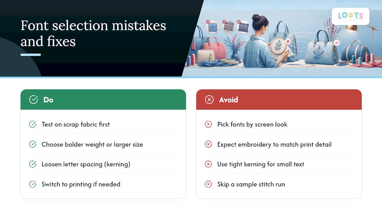
The single biggest mistake is choosing a font by how it looks on screen rather than how it will behave once stitched or printed. A crisp digital script can collapse into an illegible blur the moment a needle interprets its curves, because screens don’t account for thread thickness, stitch direction, or fabric give.
A close second is treating embroidery and printing as interchangeable. They aren’t. Printing can hold fine serifs and delicate script tails; embroidery physically cannot below a certain stroke width, no matter how good the digitizing. Picking an ornate script for embroidery and expecting print-level detail is asking the technique to do something it wasn’t built for.
Tight kerning is another repeat offender. Letters that sit close together on screen often merge into a single stitched shape once thread bulk and fabric movement come into play, which is why wider spacing than feels natural is usually the right call.
Finally, plenty of orders skip the sample stage entirely to save time, then discover the problem only after a full batch is already stitched. A five-minute test run on scrap fabric catches nearly all of these issues before they become expensive. Correcting course usually just means choosing a bolder weight, sizing up, loosening kerning, or switching from embroidery to printing for that particular design.
How to adapt a font for better readability and durability
Most fonts aren’t embroidery ready or print ready straight out of the box, and a few targeted tweaks make a real difference. Start by simplifying decorative flourishes. Swashes, extended serifs, and thin connecting strokes on scripts are the first things to fail, so trimming them back (or asking a digitizer to do it) protects legibility without losing the font’s character entirely.
Widening stroke width is the next lever. Many display and script fonts were built for print media that never has to survive a washing machine or a stitch needle. Bumping up the weight, or choosing a “bold” or “black” variant of the same family, buys you durability without changing the overall look much.
Spacing adjustments matter almost as much as the letterforms themselves. Loosen kerning between letters, and add a touch more space around ascenders and descenders so nothing crowds together once stitched or printed.
For embroidery specifically, adding pull compensation to narrow letters keeps counters (the enclosed spaces inside letters like “a” or “e”) from closing up under thread tension. For printing, boosting contrast between the text colour and the bag material does more for readability than any typeface swap. A name that vanishes into a similarly toned bag fails regardless of how good the font choice was.
Legibility over looks: a short editorial take
Font choice for bags comes down to one uncomfortable truth: what looks good on a screen and what survives production are often two different things. Prioritize legibility and a real stitched or printed sample over how pretty a font renders in a design mockup.
For a keepsake gift, a generously sized script can be genuinely lovely. For a bag that gets used every day, a sturdy block font wins nearly every time. Order a small sample before committing to a full batch. It costs little and saves you from a bag full of names nobody can read.
— Shiry
Order a sample before you commit to a full run
Some vendors build customizable cotton tote bags, loot bags, and duffles with name personalization integrated into the ordering process, not added afterward. That means you pick the font, the bag, and the colours together, and see how they actually work before committing to a bulk order for a birthday party or corporate event.
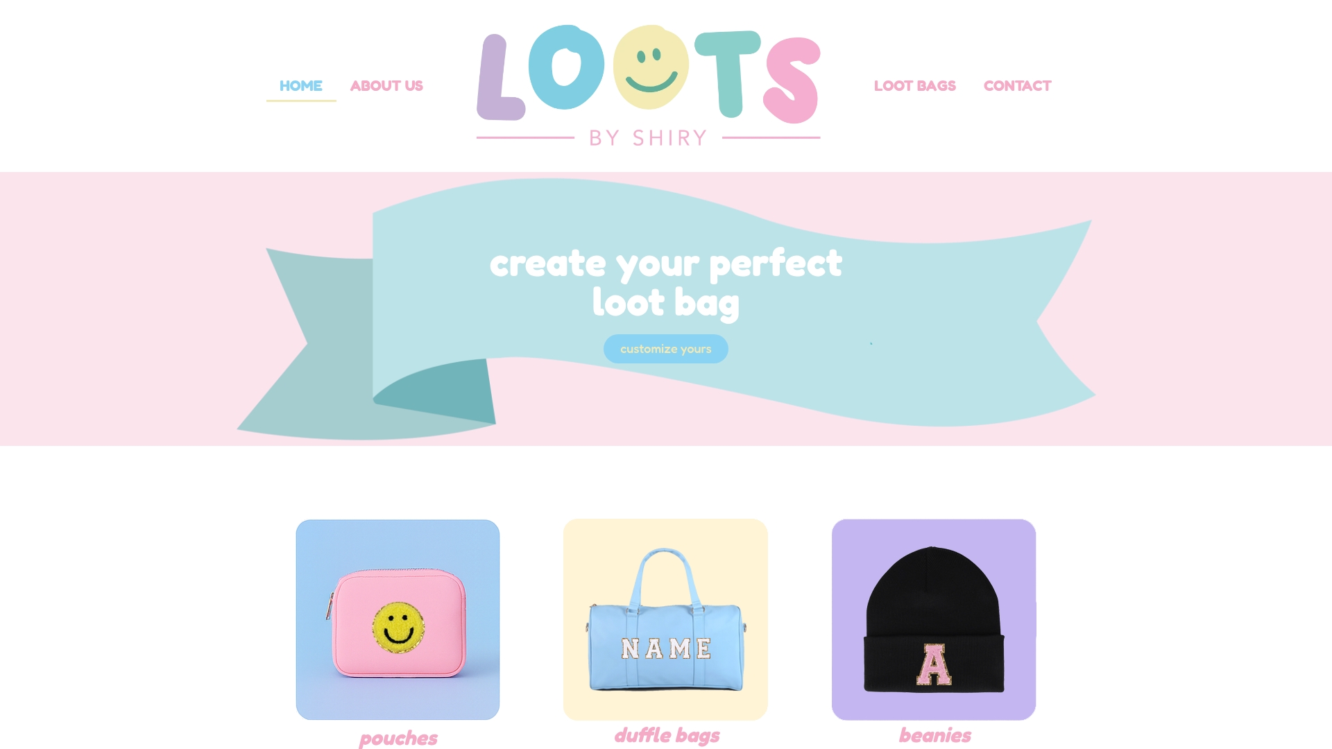
If you’re weighing Arial against Sacramento for a batch of party favours, the smartest move is ordering a small sample first, exactly the testing step this guide keeps coming back to. Browse the loot bags collection for party-ready options, or check the cotton tote bags if you want something more everyday. Either way, you’ll see your chosen font on real fabric before you order fifty of them.
Sources
- Embroidery Design & Font Guide Ontario | Intuitive Attire
- Mastering embroidery font styles — the ultimate guide for professional results
- Stitchpilot
FAQ
How do you put names on bags?
Names go on bags through embroidery (stitched thread) or printing (heat transfer, screen print, or direct-to-garment ink). Embroidery holds up better over years of use; printing handles finer, more decorative fonts.
What is the best font to print on tote bags?
Bold sans-serifs like Arial and Montserrat print cleanly at almost any size, while printing also tolerates finer scripts like Sacramento better than embroidery does. Choose based on how delicate your chosen letterforms are.
What is the best font for names on bags?
There’s no single best font. Arial, Montserrat, and Bebas Neue are the safest all-around picks for durability and legibility, while Sacramento and Lobster work well for monograms or gift bags sized large enough to stay clear.
What font looks luxury on a bag?
A clean serif or a refined geometric sans, paired with generous spacing and a high-contrast thread or ink colour, reads as premium far more reliably than an ornate script. Balance and precise digitizing do more for a luxury look than the typeface choice alone.
Does LootsByShiry offer font personalization on its bags?
Yes. LootsByShiry’s loot bags and cotton tote bags both support name personalization, letting customers choose fonts and colours as part of the ordering process.