Choose a monogram when you want a compact, decorative mark that reads as classic or upscale, and choose a full name when clarity matters more than style, especially on shared or practical items. The two biggest deciding factors are space (a monogram fits where a name cannot) and purpose (a name prevents mix-ups; a monogram signals occasion and taste).
TL;DR:
- Monograms are ideal for small accents and design motifs, while full names are better for flat surfaces that require clear identification.
- Confirm letter order, spacing, and layout at true size before production to avoid design errors, especially with three-letter monograms.
- Use monograms for occasions where style and occasion matter, such as weddings and formal gifts, and full names when clarity is crucial for daily use or shared items.
- Most mistakes happen from last-minute errors like misspelled names or incorrect letter order, so confirming details beforehand saves time.
- For consistency in sets, monograms work best across matching items, but full names ensure individual recognition, especially for children or communal items.
Table of Contents
- How monograms and names differ in visual impact, tone, and practicality
- Concrete monogram formats and name-styling choices to plan before you order
- Which occasions and product types suit monograms or full names
- Production realities: what to confirm with a maker before you place an order
- A concise checklist readers can use to decide and place an order
- How Loots by Shiry helps customers test and get the right monogram or name
- Core definition and quick difference between a monogram and a name
- Cultural and historical significance of monograms versus names
- Psychological impact or impression given by monograms compared to full names
- Digital and physical use cases for monograms and names
- The most common choices and pitfalls, from someone who ships hundreds of these
- How to order personalized loot bags and related items from Loots by Shiry
- Sources
- FAQ
How monograms and names differ in visual impact, tone, and practicality
A monogram and a name solve different problems even when they sit on the same product. A monogram is built for small spaces: it can sit on a cufflink, a napkin corner, or the flap of a tote bag without crowding the design. A full name needs width, so it works best on items with a flatter, longer surface such as a tote bag body, a beanie band, or a luggage tag.
Tone shifts with the choice too. Three stacked letters read as formal or heritage-driven, borrowing from a tradition that stretches back to cipher jewellery, where intertwined initials functioned as both decoration and personal signature. A printed or embroidered name feels immediate and casual by comparison, closer to a label than a crest.
Recognition is where the practical case for names gets stronger. At a shared event, ten identical tumblers with the same monogram style tell you nothing about whose is whose, while ten tumblers with first names solve the problem instantly. Monograms, on the other hand, integrate better into a repeated pattern: a monogram stamped consistently across a set of napkins or favour bags reads as a designed motif, while ten different full names across the same set can look busy or mismatched.
A few quick contrasts:
- Space: monograms suit small accents; names need a longer, flatter surface.
- Formality: monograms lean classic or upscale; names feel direct and personal.
- Recognition: names cut down mix-ups on shared or identical items.
- Pattern use: monograms repeat cleanly across a set; varied names can clutter it.
Neither option is better in the abstract. The right one depends on whether the product needs to look cohesive as a set or needs to identify one specific person.
Concrete monogram formats and name-styling choices to plan before you order
Monogram layout is a design decision, not a fixed rule, and monogram style guidance points out that a monogram can mean one, two, or three letters depending on the maker’s convention. Confirm letter order before you finalize anything: some sellers expect first, middle, last order, while three-letter formats often enlarge the centre letter to represent the surname, a convention worth checking rather than assuming.
Single letters work well on small accents like a patch or a pouch corner, where a bold initial reads clearly from a distance. Two-letter monograms suit couples or paired items, and they generally sit side by side rather than stacked, keeping the layout simple. Three-letter monograms carry the most tradition but also the most room for error, since the enlarged middle letter changes the visual balance completely.
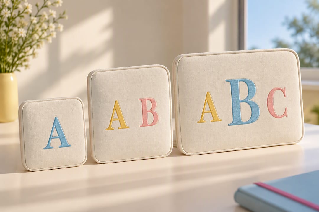
Names have their own formatting choices. All-caps reads bolder and more structured; title case feels softer and more personal. Spacing matters more than people expect: cramped letters look like an afterthought, while generous spacing on a short name can look intentional and clean.
A simple way to test any layout before committing:
- Sketch or type the letters at the actual size they will appear on the product.
- Compare at least two letter orders or spacing options side by side.
- Check how the design reads from a normal viewing distance, not just up close.
- Confirm the final version with the maker before production starts.
Wedding monogram guidance makes the same point for couples: letters that look balanced typed out in text do not always look balanced once turned into a mark, so testing multiple combinations before finalizing is worth the extra step.
Pro Tip: Print your monogram or name at true size on paper and hold it against the actual product before you approve the final design.
Which occasions and product types suit monograms or full names
The right choice often comes down to who receives the item and what they will do with it.
- Weddings: a couple’s shared monogram suits keepsakes and decor, while guest favours or vendor tags read better with full names.
- Daily-use items: tote bags, tumblers, and water bottles benefit from full names when they travel through shared spaces like schools, offices, or gyms.
- Corporate gifts: a monogram adds a polished, upscale feel for client gifts, while staff recognition items usually call for full names so the personal touch is unmistakable.
- Kids’ party favours: readability wins over style, since young children and busy parents need to identify items fast, so first names in clear lettering usually beat a decorative monogram.
Weddings are the clearest example of both options working side by side. A couple’s monogram might appear on napkins, a cake topper, or a welcome sign, while the individual thank-you gifts for the wedding party often carry full names instead, since each guest wants to see their own name, not a shared symbol.
Party favours follow a similar logic. A birthday host filling loot bags for a group of eight-year-olds gains more from clear first names than from a stylized monogram that a child might not immediately recognize as theirs. The decorative value of a monogram matters less than a fast, unmistakable label when the audience is young and the setting is chaotic.
Production realities: what to confirm with a maker before you place an order
Design choices only matter if production can deliver them accurately, and this is where most last-minute problems start.
- Confirm spelling, capitalization, and letter order in writing before checkout, since corrections after production begins often cost time or money.
- Ask how the maker handles multi-size monograms, since not every method treats all three letters the same way.
- Request a digital mockup, and a physical sample for complex or first-time monogram orders, before approving a full run.
- Ask about turnaround time for a multi-letter monogram versus a single-line name, since they are rarely identical.
Embroidery workflows often cannot stitch three differently sized characters in a single pass. Brother Canada’s guidance on three-letter monograms explains that the larger centre character is typically stitched first, with the smaller side characters positioned and stitched separately afterward. That sequencing is exactly why layout confirmation matters before an order goes into production, and why a trial stitch or preview step exists in the first place, to catch positioning issues before they become permanent.
Complex monograms generally take longer to produce than a single-line name for this reason: more steps mean more opportunities for a small shift in placement, and a careful maker builds in time for that instead of rushing it. Reviewing turnaround expectations for custom favours before ordering helps set realistic timelines, especially for events with a fixed date.
A concise checklist readers can use to decide and place an order
Once you understand the trade-offs, the decision usually comes down to four quick checks.
- Pick your priority: decorative style points toward a monogram, clear identification points toward a full name.
- Match the format to the item: small accents favour monograms, longer flat surfaces handle names comfortably.
- Mock up the design at true size: a layout that looks fine at a glance may crowd or shrink oddly on the real product.
- Default to full names for mixed-age or communal settings, since a monogram can look elegant on a card but confusing on a shared tumbler.
Running through this list takes a few minutes and avoids the two most common regrets: a monogram that nobody outside the family can read, or a full name that looks cramped and unbalanced once printed.
How Loots by Shiry helps customers test and get the right monogram or name
Loots by Shiry works through mockups before production, so customers can see how a monogram or a name actually looks on the finished item rather than guessing from a text description. That step matters most on multi-letter monograms, where spacing and letter size shift the whole layout.
Customization extends past lettering: patches, placement, and colour choices all affect how a monogram or name reads on a bag, a pouch, or a tumbler. When reaching out to place an order, it helps to have the exact spelling confirmed, the preferred letter order noted, and a sense of whether style or readability matters more for that particular gift.
Core definition and quick difference between a monogram and a name
A monogram is a design made from one or more initials, arranged as a decorative mark rather than spelled out as text. A full name, printed or embroidered, spells the recipient’s name in readable letters, prioritizing clarity over abstraction.
The quickest way to separate the two: a monogram is meant to be recognized as a design first and a set of letters second, while a name is meant to be read immediately. That difference explains most of the practical decisions that follow, from sizing to font choice to where each option works best. A monogram of three letters can look like a crest or a seal, especially with the enlarged centre-letter convention common in three-letter monogram formats, while a name in title case simply reads as text laid over a product.
Neither is a formal category with rigid rules. Both are personalization choices, and the right one depends on what the item needs to communicate: identity as decoration, or identity as information.
Cultural and historical significance of monograms versus names
Monograms carry a longer decorative history than most people realize. Cipher jewellery traces intertwined initials back through centuries of use as personal marks, seals, and symbols of status, long before monograms became a mainstream gifting trend. That heritage is part of why a monogram still reads as formal or upscale today, even on something as ordinary as a tote bag.
Decorative initials have an even older visual root. Early ornamented letters used in manuscripts and printed books, sometimes called decorated initials in scholarly discussion, ranged from simple bordered letters to highly ornate designs, showing that the idea of turning a letter into a decorative object predates modern monogramming by a long way.
Full names carry a different kind of history: identification rather than ornamentation. A name on an item has always served a practical function, from marking ownership on tools and linens to distinguishing one person’s belongings from another’s in a shared household. That functional history is why names still feel more utilitarian and monograms still feel more ceremonial, even when they appear on the exact same product.
Psychological impact or impression given by monograms compared to full names
A monogram tends to signal taste and occasion before it signals identity. Seeing three stacked letters on a gift suggests the giver put thought into presentation, even before the recipient works out whose initials they are looking at. That is part of why monograms show up so often at weddings and on formal corporate gifts: the impression of care and polish often matters as much as the personalization itself.
A full name creates a more direct, personal impression. There is no decoding involved, no need to recognize a stylized letter arrangement. It reads as “this is for you” rather than “this is elegant,” which is exactly why names tend to land better with children, in mixed groups, or on items meant for daily practical use rather than display.
Neither impression is inherently better, but they are not interchangeable. A monogrammed gift for a young child may look sophisticated to an adult and mean very little to the child, while a name spelled out on a formal wedding keepsake can feel plain next to a couple’s monogram integrated into invitations and decor.
Digital and physical use cases for monograms and names
Monograms and names behave differently once you move from a physical product to a screen. On a website or a social media avatar, a monogram works well as a compact logo-like mark, often used as a personal or small-business brand icon because it stays legible at very small sizes. A full name in the same space usually needs to shrink so much that it becomes hard to read, which is why so many personal branding avatars default to initials instead.
On physical products, the calculation flips depending on scale. A monogram embroidered on a small patch or stitched into a cuff makes sense because the surface is tiny and a full name would not fit cleanly. A name printed across a tote bag or tumbler has enough surface area to stay legible without needing to compress into an abstract mark.
The practical rule carries across both formats: use a monogram when space is limited and a recognizable icon does the job, and use a full name when the surface allows for it and clear identification matters more than compact styling.
The most common choices and pitfalls, from someone who ships hundreds of these
Couples and formal gift buyers reach for monograms almost every time. Parents organizing party favours reach for full names almost as often, because clarity wins the moment children are involved. The pattern is consistent enough that it is rarely a difficult call once someone thinks through who the item is for.
The most frequent last-minute correction is a misspelled name or a wrong letter order confirmed too late, after production has already started. Catching that before checkout, not after, saves everyone a redo.
If there is one rule worth remembering: when in doubt, pick the full name. A monogram looks better in photos, but a name never leaves anyone wondering whose gift it is.
— Shiry
How to order personalized loot bags and related items from Loots by Shiry
Customizable loot bags, cotton totes, and Colour Changing Tumblers can be built around exactly this kind of decision, letting you choose names, initials, patches, and colours before anything goes into production.
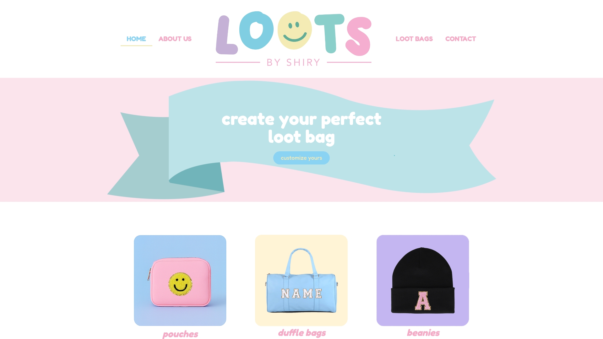
Starting an order is straightforward: confirm the exact spelling for every name or initial set, decide whether you want a monogram look or full names across the set, and note any font or colour preference. From there, a mockup shows how the layout sits on the actual product before you commit to the run.
For sets that need to stay consistent, a monogram often works better across a matching group of favours, while full names make more sense when each guest needs their own item clearly identified. Browse the shop page for cotton totes, pouches, and tumblers, or check the loot bags category for bundled favours with optional wrapping and delivery fees. Current prices are available on the client’s pricing page. Readers weighing eco-friendly materials alongside personalization can also look at sustainable gifting options for additional ideas.
Sources
- 3 letter monogram – Brother Canada
- How to create your wedding monogram
- How to choose the perfect monogram style
- Cipher jewellery
FAQ
Should a monogram be a first name or last name?
Monogram convention varies by maker, so it is worth confirming rather than assuming. Many three-letter monograms use first, middle, and last initials with the surname letter enlarged in the centre, though some sellers follow a different order entirely.
What are the rules for monograms?
There is no single fixed rule: a monogram can be one, two, or three letters depending on the design and the maker’s own convention. Layout, letter order, and sizing are design choices, so confirming the specific maker’s expected format before ordering avoids surprises.
Can you give me an example of a monogram?
A classic example is three stacked initials with the surname letter enlarged in the middle, a format long associated with formal or heritage-style personalization. A simpler example is two initials placed side by side, often used for couples or paired gifts.
Can a monogram be just one letter?
Yes, a single letter is a valid and common monogram format, especially on small accents like patches or pouch corners where space is limited. A bold single initial reads clearly even at a small size, which makes it a practical choice for compact items.