

Design proof approval is the formal confirmation that a design is ready for production, given by a specific person against a specific version of the file. The single most effective rule is to assign one named approver per stage, so feedback never arrives from three directions at once. Before anything else, run three checks: confirm you’re looking at the latest version number, read every line of copy against the approved copy deck, and verify names, dates, and prices against the source list.
- Confirm the version number matches the latest round of revisions.
- Read all copy aloud against the approved copy deck.
- Verify high-risk data: names, dates, prices, and contact details.
Key Takeaways
Design proof approval works best when one named person owns sign-off at each stage, feedback stays anchored to specific elements on the file, and every review moves through the same five checklist categories in order.
| Point | Details |
|---|---|
| One approver per stage | Name a single sign-off owner and a deputy for every approval gate to prevent conflicting feedback. |
| Check five categories every time | Review copy, high-risk data, layout, brand consistency, and production specs in separate passes. |
| Screen colour isn’t final colour | Request a hard proof or Pantone match before approving anything where brand colour is critical. |
| Use version numbers and pinned comments | Track every revision by number and keep feedback attached directly to the proof, not scattered emails. |
| Loots by Shiry proofs every custom order | Personalised loot bags go through internal named sign-off, with samples available before bulk production. |
Table of Contents
- What a design proof actually shows you
- The five categories every proof review must cover
- Who approves what, and in what order?
- Building a review template you can reuse
- How to cut revision rounds and avoid reviewer mistakes
- What sign-off actually means once you approve
- How Loots by Shiry handles proof approval for personalised loot bags
- Get your custom order proofed before it ships
- Sources
- FAQ
What a design proof actually shows you
A design proof is a preview of a finished piece, usually a PDF or on-screen file, sent for review before anything is printed, cut, or shipped. It exists to catch problems while they’re still cheap to fix. What it is not, particularly for print, is a guarantee of final colour. On-screen proofs are built primarily for checking layout and copy; colour accuracy needs its own verification step, because screen colour and printed colour are never a perfect match.
That gap matters more for some jobs than others. A digital ad running on a screen only needs a digital proof, since the final output and the preview live in the same medium. A run of embroidered patches or printed tote bags is different: fabric, thread colour, and print substrate all shift the result. When brand colour is non-negotiable, ask for a hard proof or a Pantone reference before signing off, not after the order ships.
The five categories every proof review must cover
Skipping around a proof at random is how obvious mistakes slip through. A structured pass through five categories, in order, catches nearly everything.
- Copy — read every word aloud against the approved copy deck. Don’t skim from memory; typos hide in plain sight when you already know what the text is supposed to say.
- High-risk data — check names, dates, prices, phone numbers, and any QR code or URL. A misspelled name on a personalised item is the single most common complaint reviewers report catching too late.
- Layout — confirm alignment, visual hierarchy, and that nothing critical sits inside the bleed or outside the safe zone.
- Brand consistency — logo version, exact hex or Pantone codes, and correct fonts, matched against brand guidelines rather than “close enough.”
- Production specifications — dimensions, file type, resolution, and colour mode (CMYK for print, RGB for screen).
Pro Tip: Check bleed and safety margins even when the design looks fine at a glance. A logo or name that sits too close to the trim edge can get clipped in production, and that’s an error you won’t see until the finished product arrives.
Reviewers who treat these five categories as five separate passes, rather than one blended scan, catch more. Best practice recommends checking reviewers reference the approved copy deck and specs side-by-side with the current proof, never from memory, and confirm explicitly that every marked change has actually been addressed in the current revision.
Who approves what, and in what order?
A proof that gets forwarded to everyone at once, with no order and no owner, is how projects stall for weeks. A workable approval workflow moves through stages, and each stage has exactly one name attached to the final call.
- Concept and structural stage — confirm the overall idea and layout direction before detail work begins.
- Content stage — copy, data, and messaging get locked here.
- Visual stage — colour, imagery, and brand elements get checked.
- Pre-production stage — final specs, bleed, file format, and print readiness.
Assign a reviewer to each stage based on what they’re actually responsible for, and name one approver per gate, with a deputy who can step in if that person is unavailable. Treat each gate as timeboxed: set a deadline, and decide in advance what happens if a reviewer goes quiet, whether that means escalation, an automatic approval, or the deputy taking the call. Sequential gates tend to reduce total revision rounds on higher-risk projects, compared with sending the same proof to five people in parallel and hoping their comments don’t contradict each other. Every round gets a version number, and nobody approves a proof without checking which version they’re looking at.
Building a review template you can reuse
A one-off review process gets reinvented, and often skipped, every time someone’s in a hurry. A written template fixes that. It needs four parts: a scope statement (what this proof is meant to confirm), a role-based checklist (who checks what), feedback rules (how comments get written and where), and a named sign-off owner. Locking the structure while leaving checklist items flexible per project keeps the template useful across different product types without becoming rigid.
Run the review in four single-purpose passes rather than one long scan:
- Pass one: copy and data accuracy only.
- Pass two: layout, alignment, and bleed.
- Pass three: brand and colour consistency.
- Pass four: production specs and final file check.
Splitting error types this way catches issues a single comprehensive read tends to miss, since spelling errors and layout problems pull attention in different directions. Keep every round of comments and every version on record. A simple revision log with dates, version numbers, and who approved what protects everyone if a dispute comes up later, and it takes a few minutes to maintain.
How to cut revision rounds and avoid reviewer mistakes
Most wasted rounds trace back to how feedback gets written, not the design itself. Vague email comments like “make it pop” force designers to guess. Pinned, contextual comments directly on the proof, tied to a specific element, remove that guesswork and speed up every round after the first. Centralizing feedback on the asset itself, with a visible revision history, also cuts down the confusion that comes from six separate email threads about the same file.

Separate objective checks (a wrong phone number, a missing bleed) from subjective preferences (font weight, colour warmth). Mixing the two in one comment thread is a common way approvals stall.
Pro Tip: Bring in one reviewer who hasn’t seen the design before for the final pass. Fresh eyes catch typos and awkward spacing that everyone else has stopped noticing, and a large screen beats a phone for checking fine print like a QR code or a small imprint area.
What sign-off actually means once you approve
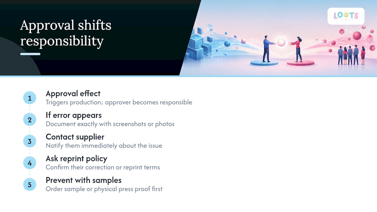
Approving a proof is not a formality. Most suppliers’ terms treat your sign-off as the trigger for production, and responsibility for anything wrong on that proof shifts to whoever approved it. If a printed name is misspelled or a price is wrong, that mistake typically ships as approved.
If an error surfaces after production has started, act fast: document exactly what’s wrong with screenshots or photos, contact the supplier immediately, and ask about their reprint or correction policy before assuming it’s unrecoverable. For high-stakes or high-volume orders, a sample order or a physical press proof upfront costs little compared to reprinting a full run.
How Loots by Shiry handles proof approval for personalised loot bags
Every personalised order starts with the customer’s own choices, names, patch selections, colour combinations, which we turn into a digital proof before anything gets produced. One named team member reviews and approves each proof internally against the customer’s request, and customers who want extra certainty can request a sample before committing to a full order. Once a proof is approved, production begins exactly as shown, no surprises.
Get your custom order proofed before it ships
Skipping a proof entirely, or approving one you’ve only glanced at, is how a batch of loot bags ends up with a misspelled name or the wrong patch colour. LootsByShiry builds a proof into every personalised order, so you see exactly how your name, patch, and colour choices look before production starts, not after.
You review the digital proof, confirm the details, and give sign-off, the same single-approver principle this whole guide is built around, just applied to your own event order. If colour accuracy matters for your event (matching a school colour or corporate palette), you can request a sample ahead of a bulk order rather than relying on screen colour alone. Browse the personalised loot bags collection, choose your names, patches, and colours, and you’ll get a proof to approve before anything goes into production.
Sources
- Building design review templates: a framework for consistent feedback
- Design review process: streamline feedback & approvals
- The ultimate guide to print proof review: what to check before final approval
- What is a design review process? Steps, types & examples
FAQ
What is a design proof?
A design proof is a preview version of a design, usually a digital file or printed sample, sent for review and confirmation before final production begins.
What are proofs in graphic design used for?
Proofs let reviewers catch copy errors, layout problems, and brand inconsistencies before a job goes to print or publication, when fixes are still inexpensive.
What is an artwork proof, exactly?
An artwork proof is the specific file version showing exact placement of text, images, and colour for a piece of artwork, matched against production specifications like bleed and resolution.
Is a digital proof enough to check colour accuracy?
Not for critical brand colour. On-screen proofs are reliable for layout and copy, but final colour needs a hard proof or a Pantone reference for accurate matching.
Who should be the final approver on a design proof?
One named person per approval stage, with a deputy assigned in case they’re unavailable, keeps feedback consistent and prevents late-stage revision loops.