

Pick a coordinated palette for a polished look, a thematic palette when the event has a clear story to tell, and a mixed rainbow for young kids’ parties where energy matters more than restraint. Coordinated works for weddings and baby showers, thematic suits birthdays with a strong concept, and rainbow mixes fit multigenerational gatherings. Once you have picked a direction, check material, contrast and fill before you order.
TL;DR:
- Coordinated palettes should stay within two to three colors to maintain a polished and intentional look, regardless of the event type or season.
- Material choice significantly affects the bag’s appearance and reuse potential, with laminated and cotton options offering more durability and metallic finishes emphasizing shine.
- Accessibility considerations include using high contrast for labels and pairing color with shape or text to ensure readability for all guests.
- Fill selections should match the guest’s age, with small toys and bubbles for toddlers and personal items or keepsakes for adults, avoiding small parts for young children.
- Customizable bag options with precise color matching and personalisation enhance the gift’s perceived value, especially for intimate or upscale events.
Table of Contents
- Palette ideas: five go-to colour directions
- How to match bag colour to theme and guest age
- Practical selection: material, finish and where colour matters most
- Accessibility and contrast: making tags and labels readable
- What to put in party bags and quick fill-by-age lists
- Styling tricks and finishing touches that make colour sing
- Custom options and why personalised colours matter
- Sourcing party bags in the colours you actually want
- Trends in party bag colors for current year and seasons
- Why colour planning matters beyond aesthetics
- How Loots by Shiry can help with custom colours and finishing
- Sources
- FAQ
Palette ideas: five go-to colour directions
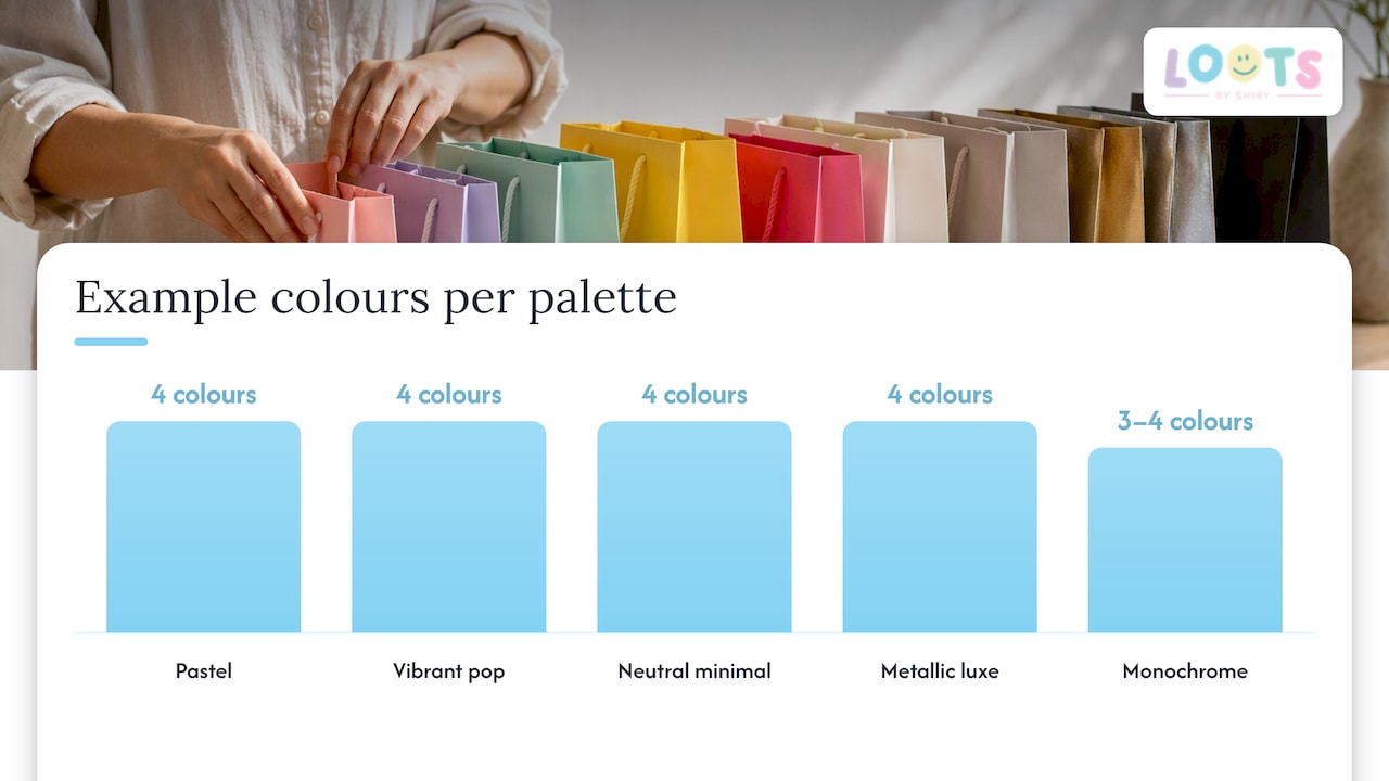
Five directions cover almost every event, and each one signals something different before a guest opens the bag.
- Pastel: soft pink, mint, lavender and butter yellow suit baby showers, spring birthdays and garden weddings.
- Vibrant pop: hot pink, cobalt, orange and lime work for kids’ birthdays and carnival or circus themes.
- Neutral minimal: kraft brown, sand, sage and off-white fit rustic showers, boho weddings and adult milestone birthdays.
- Metallic luxe: rose gold, champagne, silver and black suit anniversaries, quinceañeras and New Year’s Eve parties.
- Monochrome: one colour in three or four shades (light to dark) fits sports themes, graduation parties and brand-aligned corporate events.
Each palette survives a small budget or season swap. Pastel goes autumnal with the addition of a terracotta accent instead of mint. Vibrant pop can be toned down for a smaller guest list by using one bold colour with white rather than four bold colours at once. Neutral minimal upgrades for a formal event with a single metallic ribbon. Metallic luxe stretches further on a budget by using metallic accents (ribbon, stickers) on a plain coloured bag rather than an all-metallic bag. Monochrome is the easiest to source cheaply since one colour in bulk often costs less than four separate colours.
The common thread across all five is restraint: two to three colours per bag, not five, keeps the result looking planned rather than accidental. A pastel bag with a single vibrant ribbon reads as styled. A pastel bag with four competing accent colours reads as leftover craft supplies. When in doubt, pick the palette’s dominant colour first, then add one accent and one neutral (white, kraft or black) to ground it.
How to match bag colour to theme and guest age
Colour choice depends as much on who is opening the bag as on the party’s theme.
- Toddlers and young kids respond to high saturation: primary reds, blues and yellows read as fun and are easy to spot in a pile of gifts.
- Tweens tend to prefer curated palettes to primary brights: think millennial pink, teal or a single bold colour paired with black or white.
- Adults generally favour neutral or metallic palettes that double as table décor, since an adult favour bag often sits on a place setting before it goes home.
- Fairy or woodland themes pair well with sage green and blush as the main colours and gold as the accent.
- Safari themes suit kraft brown and mustard as the main colours with a pop of orange as the accent.
- Retro themes work with mustard, teal and burnt orange together.
- Luxe adult events pair black or navy as the main colour with rose gold or silver as the accent.
Many hosts scale back or stop formal take home bags once children reach their early teens, shifting instead to a shared dessert table, a photo booth print or a small experience favour like a custom tumbler that guests can use immediately rather than unwrap later.
Practical selection: material, finish and where colour matters most
The same colour looks different depending on what it is printed or dyed onto, so material choice affects the final result as much as the colour name does.
- Paper bags show flat, matte colour and work well for one-time, budget-friendly favours.
- Plastic or cellophane bags add shine and can make bright colours look more saturated, which suits vibrant pop or metallic palettes.
- Cotton bags hold colour more softly and read as premium, making them a natural fit for cotton tote bags used as keepsakes rather than disposables.
- Laminated or foil finishes intensify metallics and are worth the extra cost when the palette depends on shine, such as rose gold or silver luxe themes.
Paper and plastic cost less but rarely survive being reused, while cotton and laminated finishes cost more upfront and are worth it when the bag itself is part of the gift, as with a keepsake tote a guest keeps for groceries or the gym. Exact colour matching matters most when a bag ties into branding, a colour-coordinated photo backdrop or a matching table setting captured in photos. For a birthday party at home with no photo styling plan, a close shade in the same family (blush instead of exact pink) is generally fine and far easier to source quickly.
Accessibility and contrast: making tags and labels readable
A pretty palette does not help if the name tag or allergen label on the bag is hard to read. Accessibility guidance recommends designing for users with low vision by keeping strong contrast between text and background and never relying on colour alone to communicate something important, like a dietary label or an age group. Separate colour style guidance reinforces the same principle: pair colour with shape or text so the message still lands for guests who see colour differently.
Pro Tip: Print tags in black text on a light background, then add a small icon (a star, a leaf) next to any colour-coded age or dietary cue so the information survives even in greyscale.
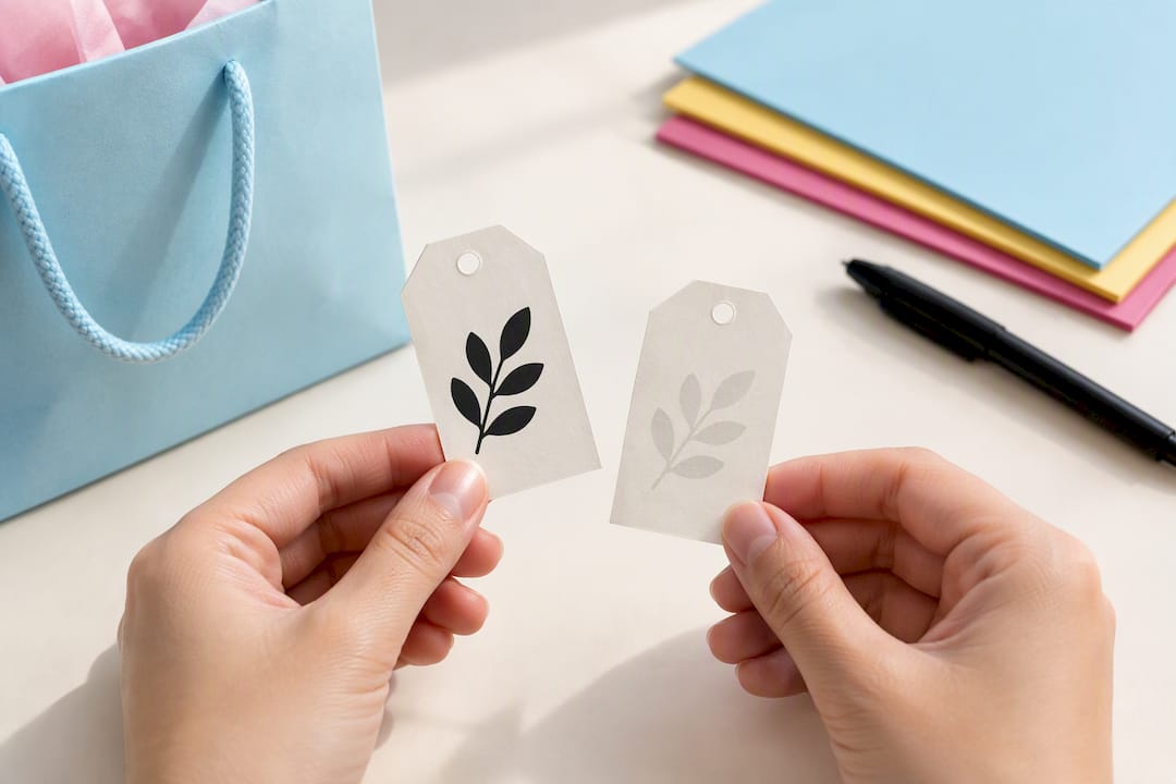
Two quick checks catch most problems before bags go out: view your design in greyscale to confirm the text still stands out, and run it through a free colour blindness simulator to catch red-green pairings that can disappear together.
What to put in party bags and quick fill-by-age lists
Fill should match the age group first and the colour palette second, since a beautifully coloured bag with the wrong contents falls flat.
- Toddlers (ages 1 to 3): board books, large chunky stickers, a soft toy, bubbles and a bib, avoiding anything with small parts.
- Children (ages 4 to 9): temporary tattoos, colouring supplies, a small puzzle, bouncy balls and a lollipop such as the Funny Kidz Cup Cake lollipop.
- Tweens and teens (ages 10 to 15): lip balm, a phone accessory, a journal, a snack pack and a colour changing tumbler.
- Adults: a mini candle, a local treat, a personalized keepsake or a small plant.
Always check choking hazard warnings on anything given to children under three, and keep loose small items out of toddler bags entirely. Heavier or bulkier fill (a tumbler or a jar) calls for a sturdier bag, like cotton or a structured paper bag, rather than a thin cellophane one that might tear on the way home.
Styling tricks and finishing touches that make colour sing
Small finishing details do more work than a bigger bag or a bolder colour.
- Tie a ribbon in the accent colour rather than the main colour, since contrast reads better than matching.
- Layer tissue paper in two shades of the same family before adding items, so a peek inside the bag already looks styled.
- Add a single sticker or wax seal in a metallic tone to lift a matte paper or cotton bag.
- Use a kraft or white tag as a base for any printed name or icon, keeping the message legible against a coloured bag.
- Repeat one texture (a ribbon, a stamp, a tag shape) across every bag so a mixed colour set still looks like one collection.
Pro Tip: Test your finished bag in the room where it will actually sit, since morning light and evening light change how saturated a colour looks.
On the day, run through a five-item check: bags filled, tags attached, ribbons tied, fragile items cushioned, and bags grouped by age if your palette varies by guest group to keep organization clear.
Custom options and why personalised colours matter
Personalised colours change how a favour feels the moment a guest sees it. At Loots by Shiry, adding a guest’s name or a patch to a bag in their favourite colour turns a generic favour into something they are more likely to keep and use again, rather than one more bag heading to the recycling bin. The pastel pouches suit delicate palettes and small gifts, cotton tote bags work as reusable keepsakes for adult or eco-conscious events, and colour changing tumblers add an interactive element that highlights the palette you have chosen. Each product lets colour, name and finish be selected together rather than picked from a fixed set.
Sourcing party bags in the colours you actually want
Craft stores and general party retailers carry a narrow range of stock colours, which works fine for a coordinated palette in common shades like pink, blue or kraft brown. Once a palette calls for a specific shade (a precise sage green, a particular metallic) or a name and colour combination for each guest, a customisable supplier becomes the more reliable route, since it lets you specify the exact colour rather than choosing the closest match on a shelf.
Cost generally scales with customisation and material. Plain paper bags in stock colours are the cheapest option and suit large guest lists on a tight budget. Cotton totes and other keepsake materials cost more per bag but are meant to be reused, which changes the value calculation for a smaller, higher intention guest list such as a wedding or a milestone birthday. Personalisation (a name, a patch, a specific colour match) typically adds a small per bag cost on top of the base bag price, and delivery or wrapping fees can apply depending on the supplier.
Before ordering in bulk, confirm the supplier’s minimum order size, turnaround time and whether a sample or proof is available, since colour can shift slightly between a screen preview and the finished product. Building a small physical collage of your chosen bag colour next to your ribbon, tissue and any printed tags before placing a full order helps confirm the combination works together in person, not just on screen.
Trends in party bag colors for current year and seasons
Seasonal palettes continue to shape which colours feel current, even as classic combinations like pastel for spring and metallic for winter hold steady. For 2026, muted and earthy tones (sage, terracotta, warm sand) are showing up alongside brighter accents rather than replacing them, giving hosts a way to keep a palette grounded while still adding one saturated colour for visual interest. Monochrome sets, where one colour appears in several shades on the same bag, continue to suit sports themed and graduation events because they photograph cleanly and scale easily across a large guest list.
Multicultural and destination-inspired palettes are also shaping event colour choices, with stylists building what amounts to a colour story rather than a single accent colour, drawing on traditions and design cues tied to specific communities and celebrations to guide the palette. Seasonal shifts still matter practically: warmer months favour lighter, higher saturation colours that read well in daylight, while cooler months lean toward metallics and deeper tones that hold up under indoor lighting. Whatever the trend, the underlying rule stays the same: a palette built around two or three colours reads as intentional regardless of which specific shades are in fashion that season.
Why colour planning matters beyond aesthetics
Colour is the first thing a guest notices before they read a single word on the tag, and getting it right is less about following a trend and more about matching the feeling you want the event to have. I have watched a simple palette change (swapping four competing brights for one bold colour and a neutral) turn a chaotic looking table into one that photographs well and feels considered. Designers describe colour as inherently subjective and expressive, and standardised colour systems help with consistency but should never replace an intuitive read of what actually suits the room. Once you trust your eye on a direction, choosing and ordering the bags themselves becomes the easy part.
— Shiry
How Loots by Shiry can help with custom colours and finishing
Once you have a palette in mind, the next step is ordering bags that actually match it rather than settling for the closest shade on a shelf. Loots by Shiry lets you choose the bag colour, add a guest’s name or a patch, and pick a finish that fits your event, whether that is a pastel pouch for a baby shower, a cotton tote for a keepsake favour, or a loot bag built around your exact palette.
Ordering starts with browsing the shop to choose a product line and colour, then adding personalisation details like names or patches before checkout. Delivery and wrapping are available for a small additional fee if you would rather the bags arrive ready to hand out. Browse the loot bags category to start building a set in your chosen palette.
Sources
Accessibility guidance in this article comes from designing for users with low vision and the Canada.ca colour style guide, both used for contrast and label readability recommendations. Colour subjectivity commentary draws on the Design Museum’s discussion of colour, used to frame palette choice as a design judgment rather than a fixed formula.
- Designing for users with low vision- Digital Accessibility Toolkit
- Colours style – Canada.ca
- The subjectivity of colour – Design Museum
FAQ
What should be in a party bag?
A good party bag matches the guest’s age: small toys and bubbles for toddlers, colouring supplies and treats for children, and personal items like lip balm or a keepsake tumbler for tweens and adults. Keep small parts out of bags meant for children under three to avoid choking hazards.
At what age do you stop doing party bags?
Many hosts scale back traditional take-home bags once children reach their early teens, shifting toward shared experiences like a dessert table or a photo booth instead. There is no fixed age, and some hosts continue with simplified, adult-appropriate favours like a candle or a small keepsake well into adulthood.
What party favors do people actually like?
Favours that guests use again, such as a reusable cotton tote bag or a colour changing tumbler, tend to get kept longer than small disposable toys or candy. Personalisation, like a guest’s name on the bag, also tends to make a favour feel worth keeping rather than discarding.
What are some good goodie bags for parties?
Goodie bags built around a clear two or three colour palette, matched to the event’s theme and the guests’ age group, read as more intentional than a bag stuffed with mismatched extras. Options like pastel pouches for a baby shower or personalised loot bags for a birthday let hosts match the bag itself to the palette rather than just the items inside it.